
Empower people to learn new vocabulary.
CONCEPT
BRAVO! is a generally free mobile application that makes learning vocabulary easy and fun. The learning materials are divided into categories and presented as short videos.
All lessons can be downloaded so that the user to study online and offline. BRAVO! is a project that was created for the CareerFoundy BootCamp.
PROBLEM STATEMENT
Busy professionals need an easy and time-efficient way to learn vocabulary online and offline, regularly review their progress, and find all the vocabulary they need to be separated by category. We will know this is true when we see our users download materials and take the level check test.
EMPATHIZE
Competitive analysis
Contains: Duolingo, Memrise, Busuu, PONS, and Deutsch perfect Wort des Tages
Through competitive research, I got an idea of how my competitors are doing, who is best at solving users' problems, and what options there are to meet the unsatisfied users` needs. I identified key objectives, general marketing strategies, market advantages, and marketing profiles.

Key insights
Two in five have a paid version and do a lot of advertising for it.
The "download a lesson" option is only available for the paid version of these two competitors.
Two out of five have a modern-looking and interesting interface.
One competitor offers a language certificate.
Two competitors offer a language test to check the language level of the user.
Survey
To determine common pain points and areas for improvment I conducted user survey with 12 questions.

Key insights
100% of the participants have a bachelor's degree or higher.
89% of users expect a language test in an app.
66% of the experts have the opportunity to learn offline.
44% think it is very important that a learning app can download lectures.
55% of the participants are Visual learners.
User Interviews
To find out more about my potential users and how they learn new languages, I conducted 5 interviews with people from my target audience - young professionals and students.
Some of the questions that the target audience was inquired:
What is your motivation to learn a foreign language? Is there a language that you want to learn?
Tell me about the last time you’ve been frustrated with jargon and new vocabulary.
How do you best remember new information?
Do you find learning apps helpful? What are the advantages and disadvantages in your opinion?
Approximately how much time do you spend on your phone per day and what do you usually do?
How do you research a product before buying it online?

Affinity mapping
To collect and organize the data from the interviews with users, I created an affinity map.

Key insights
All participants show interest in the culture of the country, and which language they study.
Learning with the mobile app should be interesting and engaging.
It is frustrating to depend on the internet to study.
A learning app must be well-structured and easy to use.
Communication and development are the main motives for learning a foreign language.
3. DEFINE
User Personas
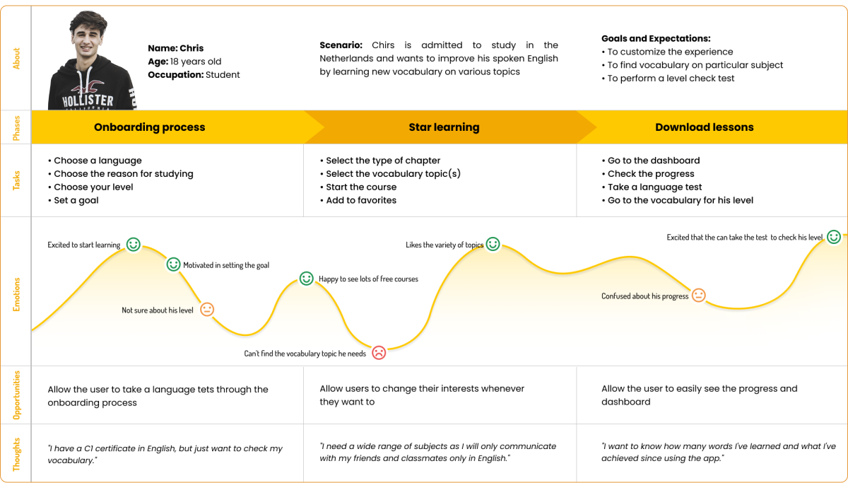
Based on the information I gathered during my research phase and to understand users' needs and experiences, I created two user personalities, Sophie and Chris.


Empathy maps

To get a deeper insight into my potential users I created empathy map for each of them.

Journey Maps
I created User Journey Maps to identify gaps in the customer experience and explore new opportunities.

4. IDEATE
User Flows
Based on the data collected, I created user flows that depict how my app should interact with potential users.
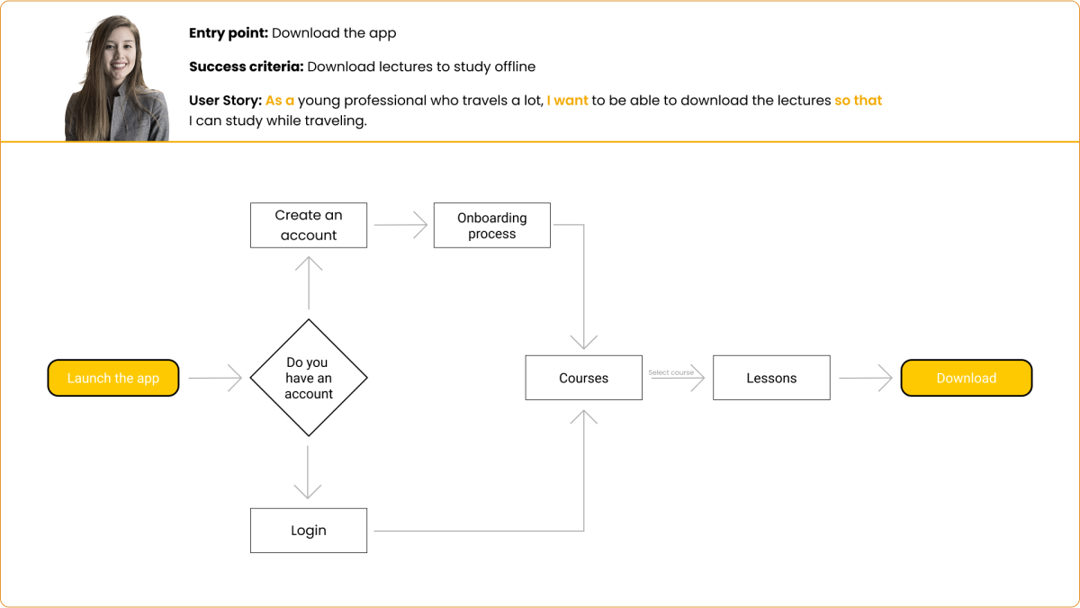
Tree Test
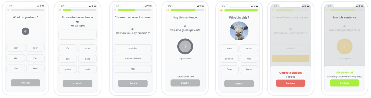
Participants had to complete the two main tasks for the app: Download a lesson and Take a QUIZ.
In the first version of the sitemap, the start menu was labeled "Courses" which caused confusion among attendees and some of them felt they should go there to download a lesson.
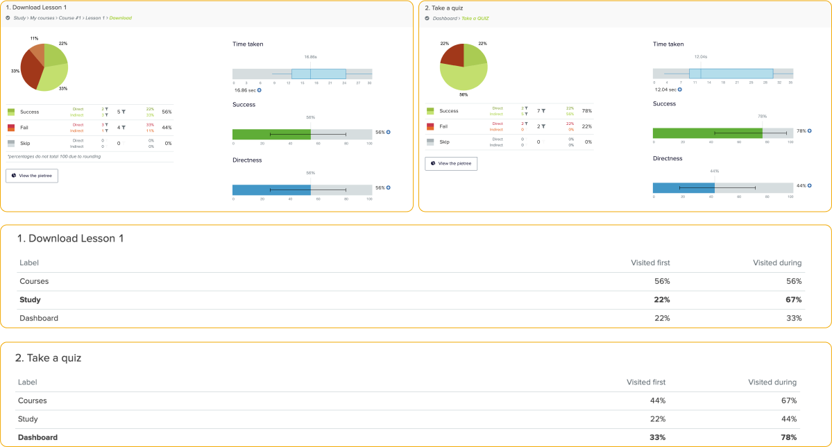
Key insights
56% successfully found how to download a lesson.
It took an average of 16.87 seconds for participants to figure out how to download a lesson.
44% of attendees couldn't find where to download a lesson from.
78% of the participants found out where to take a QUIZ to check their language level.
It took participants on average 12.04 seconds to figure out how to start the QUIZ.
5. PROTOTYPE
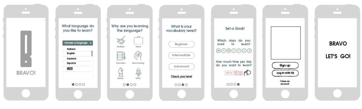
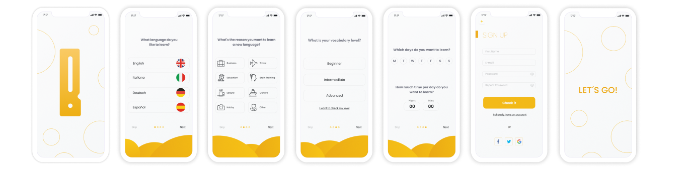
Low fidelity (Onboarding)

Mid fidelity (Onboarding)
High fidelity (Onboarding)

6. TEST
Preference Testing
The purpose of this test was to assess the users` preferences regarding the location of the QUIZ button. There isn't a significant difference in the results, which means I will either have to recruit more participants or continue with the design that I prefer.
44%
56%
First-click test
To evaluate the statement that changing the name of the menus would make it clearer where to find the option to download lessons, I conducted a First-click test.
100% of the participants found it within a few seconds.

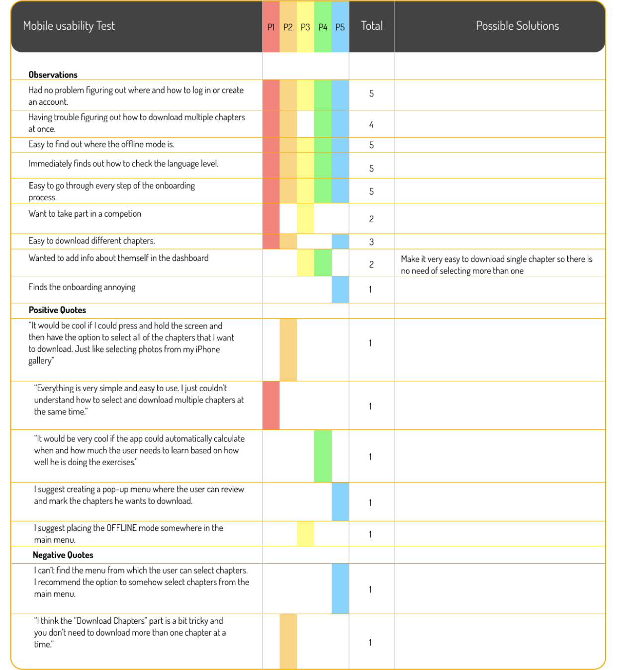
Usability Testing
To evaluate the usability of my product, I conducted a user test with 4 participants.

Research analysis and reporting
To record whether the participants acted as I expected, I created a new affinity map and a rainbow spreadsheet. It provides a very clear structure of what the participants did during the test.
7. DESIGN SYSTEM
Colors

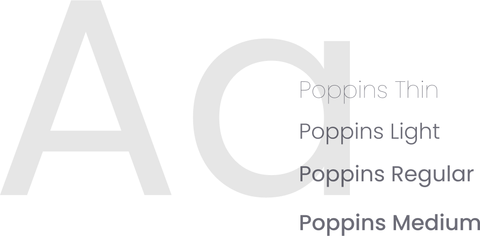
Typography
Logo


The logo combines the letter B with an embedded exclamation mark.
Icons

8. CONCLUSION
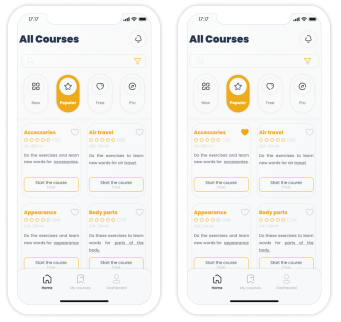
All Screens
Onboarding
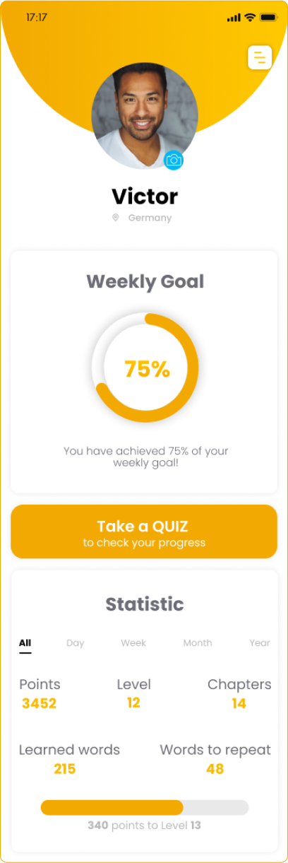
Home page
Interactive Prototype
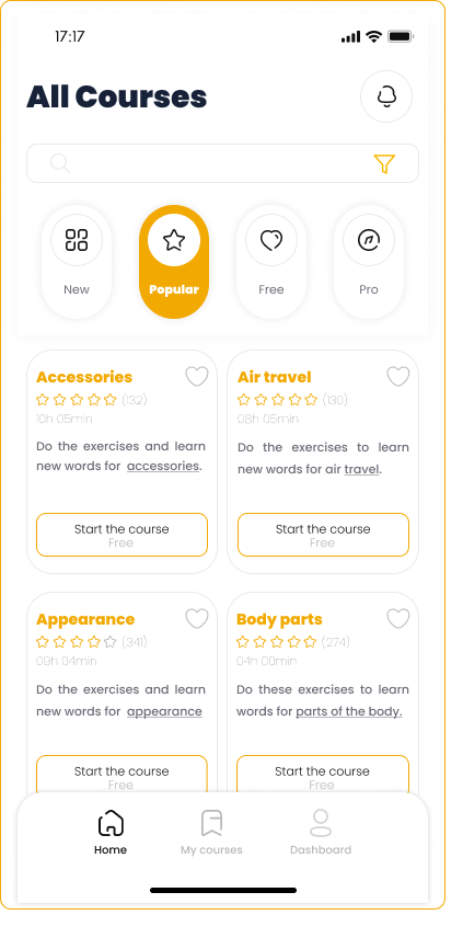
My courses

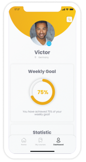
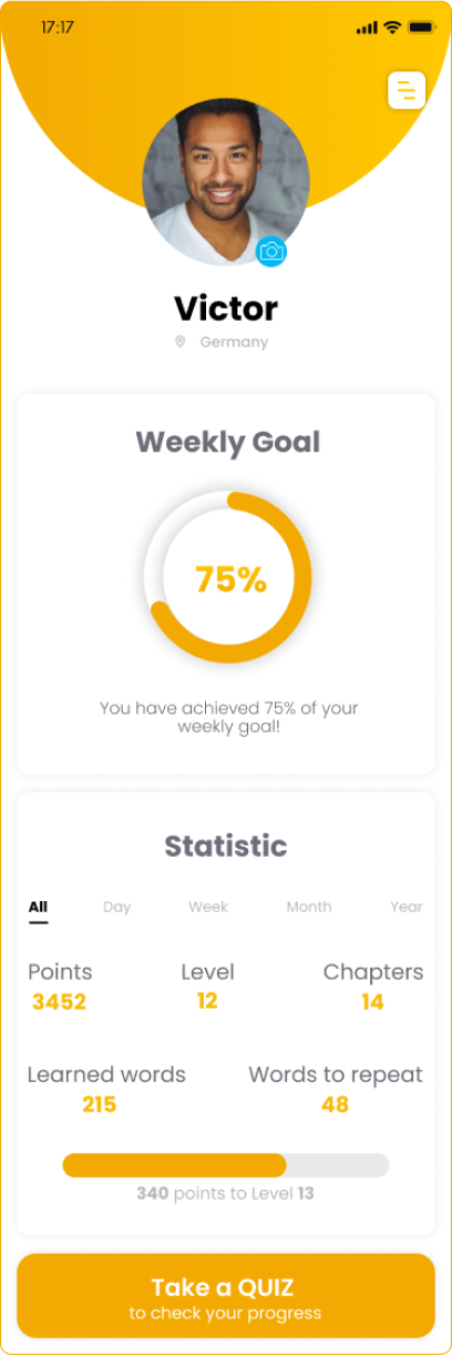
Dashboard