
HOME PAGE ANALYSIS
WHAT IS STACKIT?
STACKIT is a cloud service provider offering secure, GDPR-compliant solutions for European businesses. It provides scalable cloud infrastructure, colocation, and managed IT services, all hosted in eco-friendly data centers powered by renewable energy.
MY ROLE
My role in this project included evaluating the current STACKIT website by conducting a comprehensive inventory of its features, conducting research to understand user needs and analyze competitors.
METHODOLOGY
I partially applied the Design Thinking methodology, tailoring it to suit this case study's specific needs and requirements to effectively structure and guide the project's progress.

Current Home Page Analysis
I conducted an overview of the current homepage to evaluate its strengths and weaknesses and to gain a deeper understanding of STACKIT's existing offerings and user experience.

Site map
I mapped the current version of the website to clearly understand its existing structure and content, providing a foundation for the redesign.


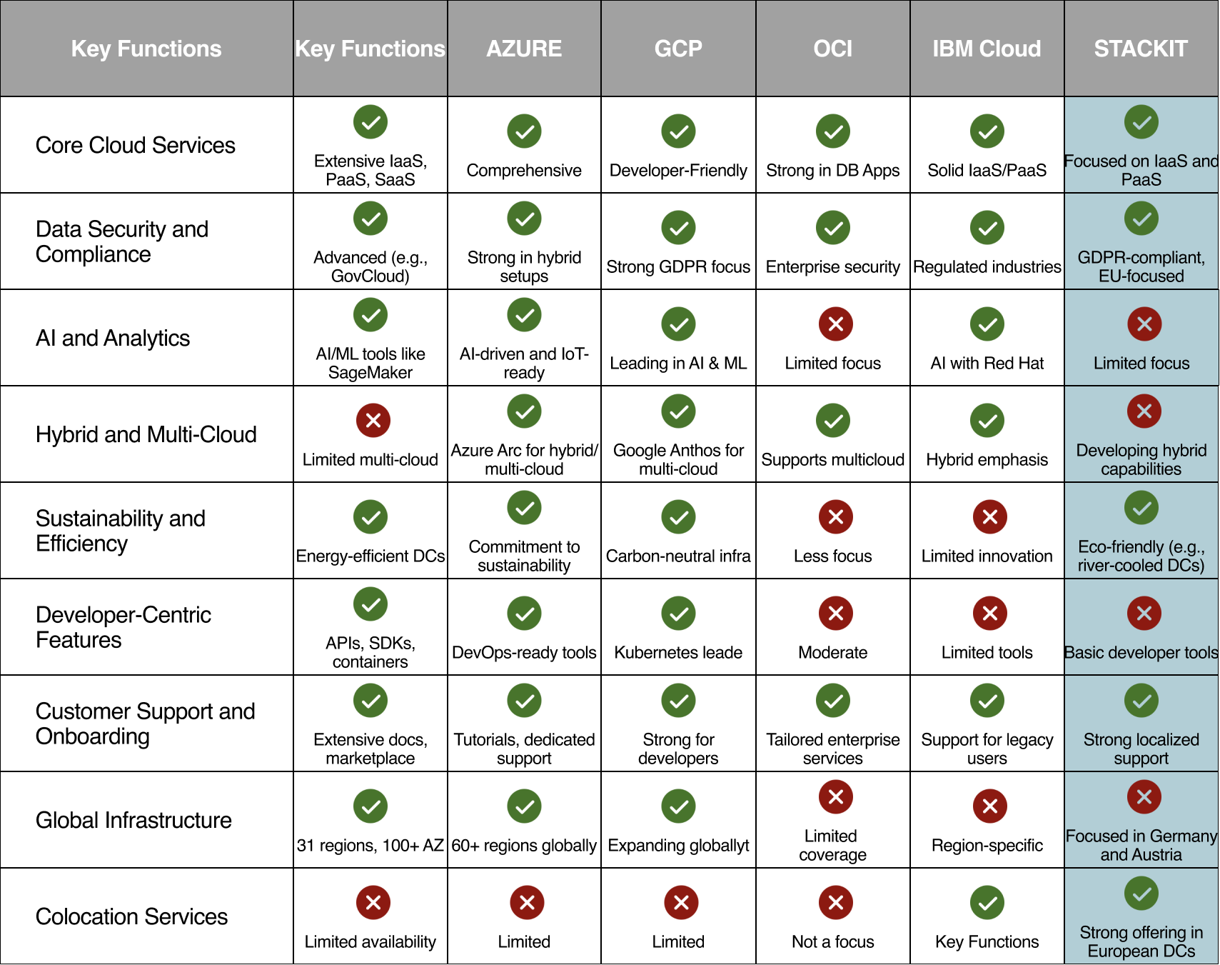
Competitor Table
I created the competitor table to compare STACKIT’s offerings with industry leaders and highlight key functions important to cloud service users, such as scalability, security, and developer tools. Areas for improvement will be detailed later in the presentation.

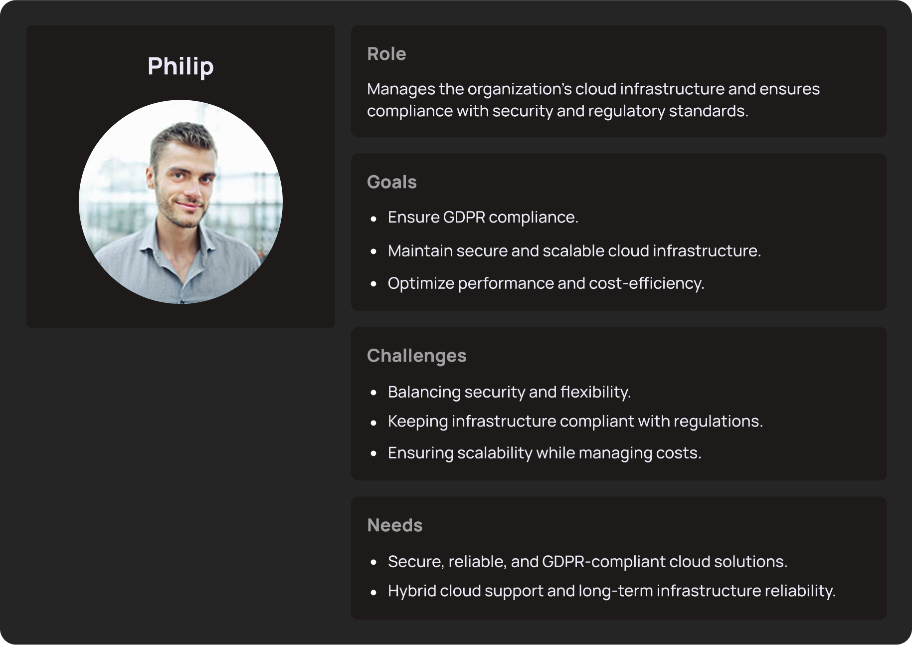
User Persona
For the purpose of this case study, I have focused on a single user persona: the IT Manager (Enterprise-Focused). This persona is responsible for managing and maintaining secure cloud infrastructure, ensuring compliance with data protection regulations like GDPR, and optimizing system performance.
User flow (First Time User)
The user flow for a first-time visitor to the STACKIT website begins with exploring cloud solutions. The user navigates through the homepage, where they can quickly access detailed information about STACKIT’s key services like GDPR-compliant cloud solutions, hybrid cloud options, and managed IT services. This flow ensures that the user has a clear path from learning about the solutions to obtaining the help they need, all while introducing them to the essential services on the website.


Testing Methods for User-Centered Design
Open Card Sort
Description: Participants organize content into categories that make sense to them, helping understand how users group and label information.
Example: Asking users to categorize STACKIT’s services (e.g., hybrid solutions, cloud infrastructure, managed services) to refine the information architecture.
Task-Based Scenarios
Description: Users are asked to complete tasks on the site, simulating real-world activities to assess how well the design supports user goals.
Example: Asking an IT Manager to find and sign up for a hybrid cloud solution, testing if the process is intuitive and efficient.
Surveys and Interviews
Description: Collecting qualitative and quantitative feedback from users through surveys or one-on-one interviews to gain insights into their needs and satisfaction with the site.
Example: Conduct interviews with IT Managers to gather feedback on their experience with the site’s cloud service offerings and whether it meets their business needs.

STACKIT’s Unique Selling Points (USPs) Compared to Competitors
GDPR Compliance and Data Sovereignty: STACKIT stands out as a European cloud provider focused on GDPR compliance and hosting data in secure, localized data centers, which appeals to businesses with strict data regulations.
Sustainability: With eco-friendly operations like river-cooled data centers and renewable energy usage, STACKIT offers a strong environmental focus, setting it apart in a market where sustainability is increasingly important.
Colocation Services: Unlike most competitors, STACKIT provides robust colocation options, catering to businesses that require a mix of physical hardware and cloud-based solutions.
Localized Expertise: As part of the Schwarz Group, STACKIT offers a trusted, European-focused service that ensures reliability and tailored solutions for regional customers.
Weaknesses
Complex Navigation: The menu structure is focused on services rather than the needs of the users, making it difficult for first-time visitors to quickly find relevant information. The lack of intuitive paths makes navigation cumbersome
Overwhelming Content: The text-heavy design might overwhelm the users. There is a lack of visual breaks like images, icons, or concise summaries, which can make the content difficult to scan and digest
Visual Design: The design feels outdated, lacking modern elements like dynamic visuals and bold typography. It appears static and doesn’t engage users effectively, making the platform look less innovative and user-friendly. A design update is needed to create a more contemporary experience.
Call-to-Actions (CTAs): CTAs are not prominent or engaging. There is no clear, attention-grabbing button like "Try Now" or "Get Started," which could encourage user conversions.